
SIERRA HEALTH GROUP BRAND REDESIGN
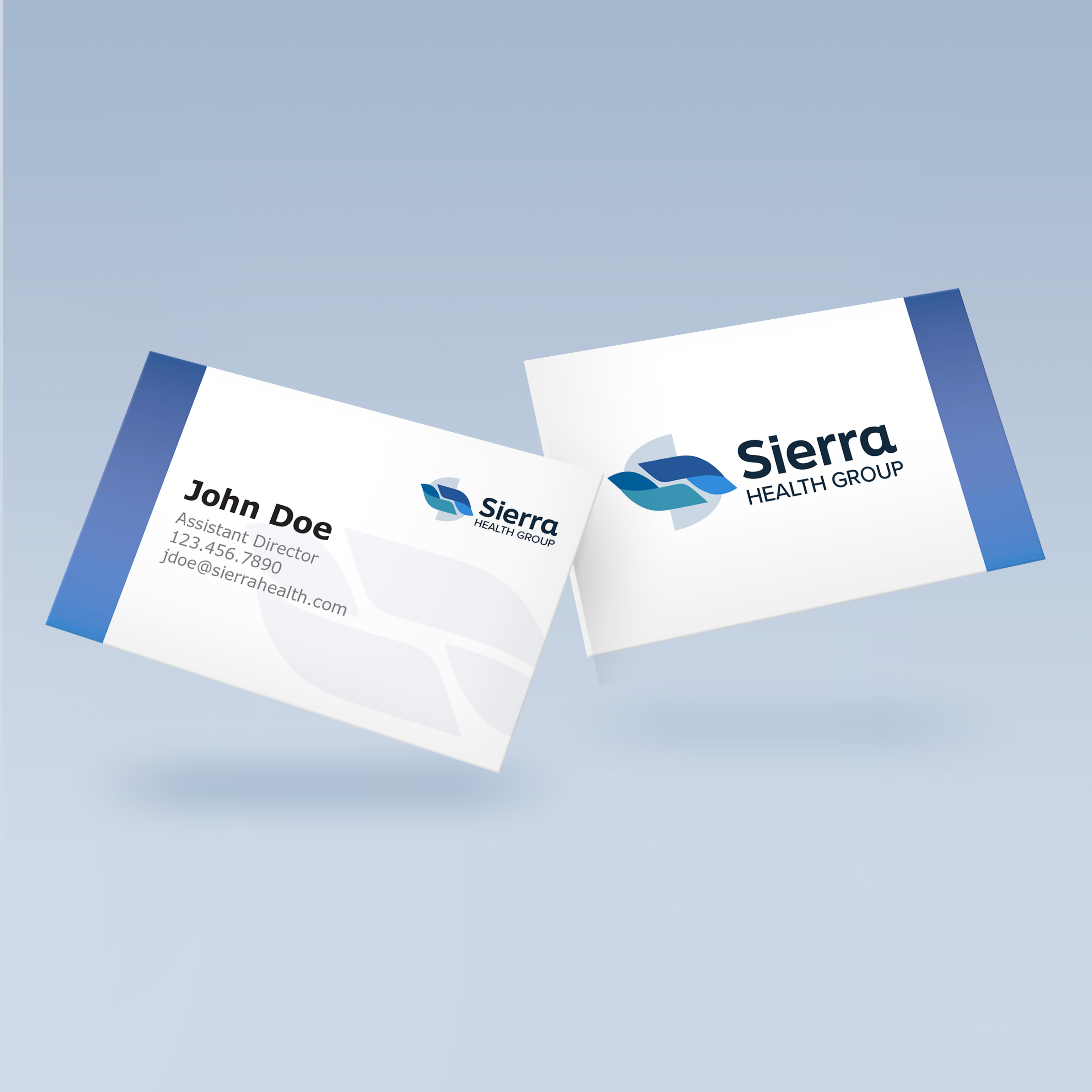
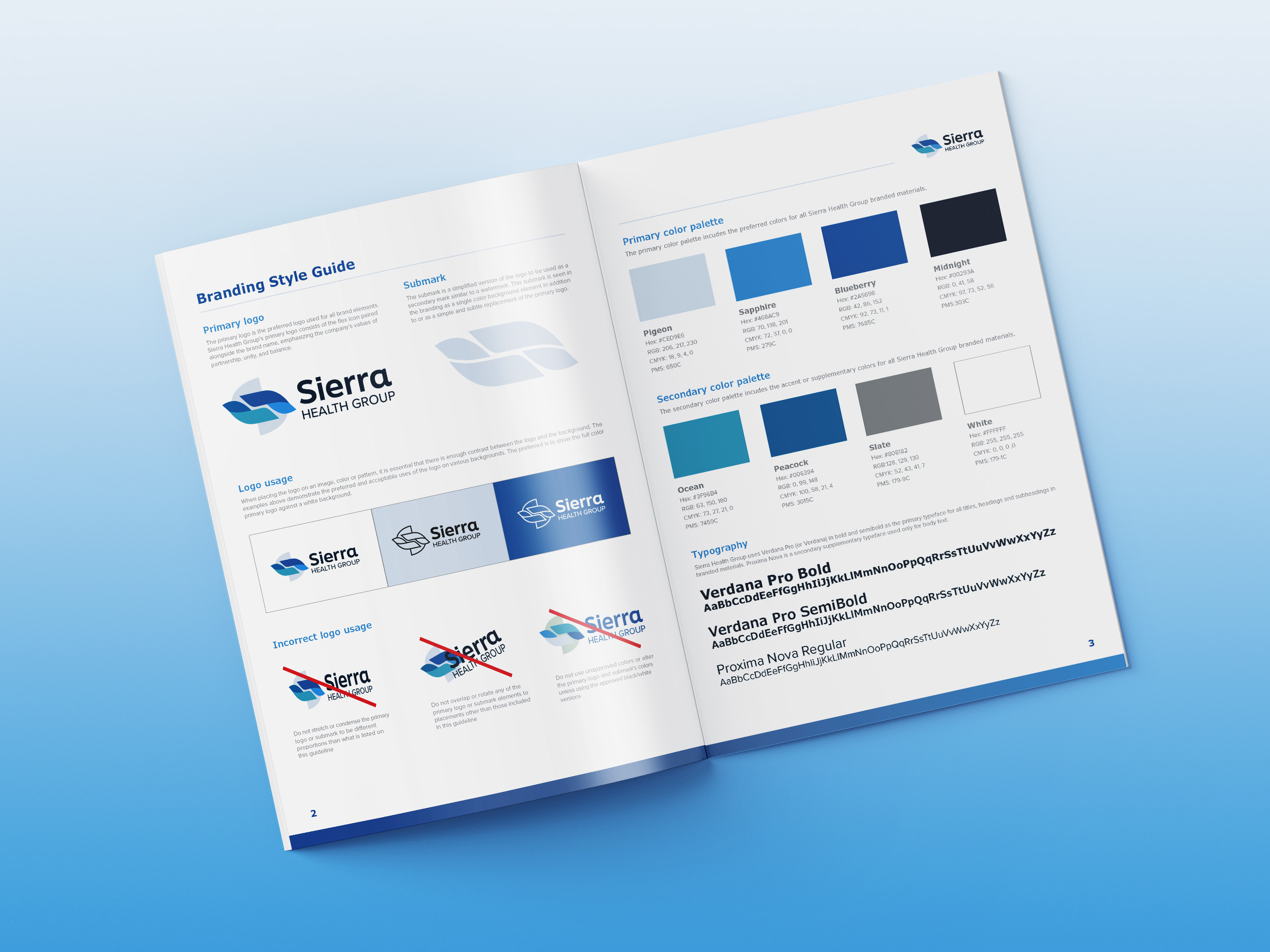
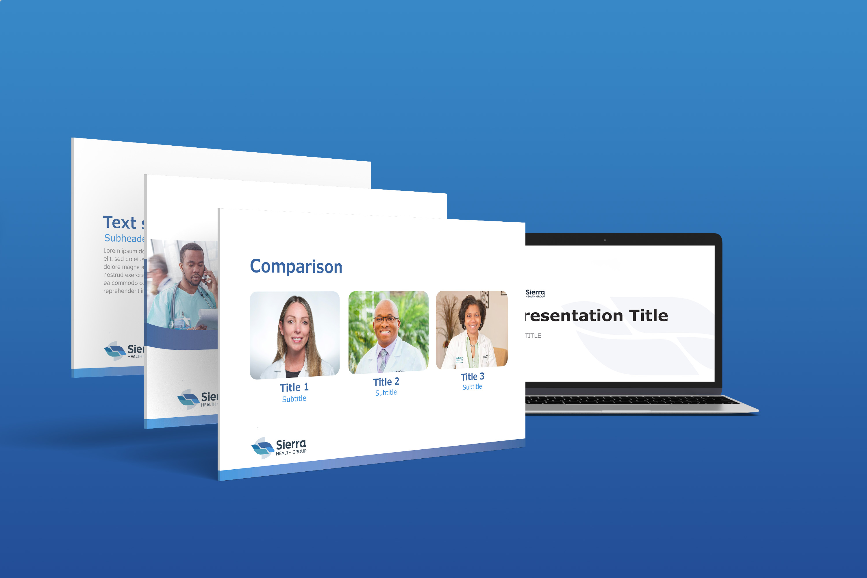
New Jersey based hospital and physician revenue cycle service provider Sierra Health Group asked me for a brand redesign to reflect their commitment to flexibility and customized solutions. The centerpiece of the new brand identity is the icon, featuring a blue and teal color scheme and flexible shape conveying partnership, unity, and support for work/life balance. The design of the brand identity is both corporate and professional, with a minimalist and modern touch provided by the use of gradients. The balanced blue and teal shapes in the icon and graphics create a sense of harmony, while the use of gradients adds depth and dimension. This project showcases my ability to create a cohesive and effective brand identity that accurately represents a company's values and mission as well as my proficiency in using design principles to communicate complex ideas and emotions through visual imagery.