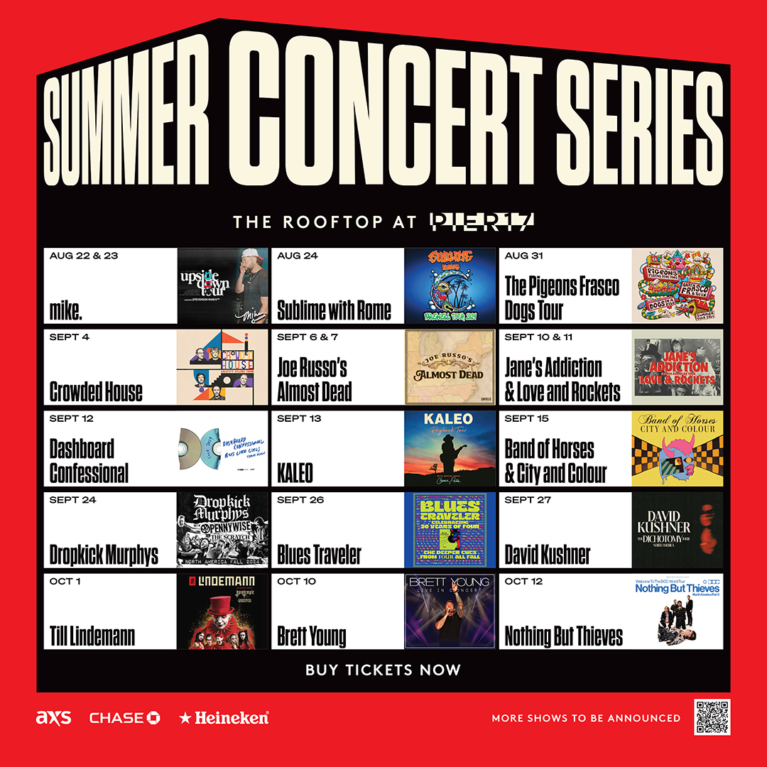
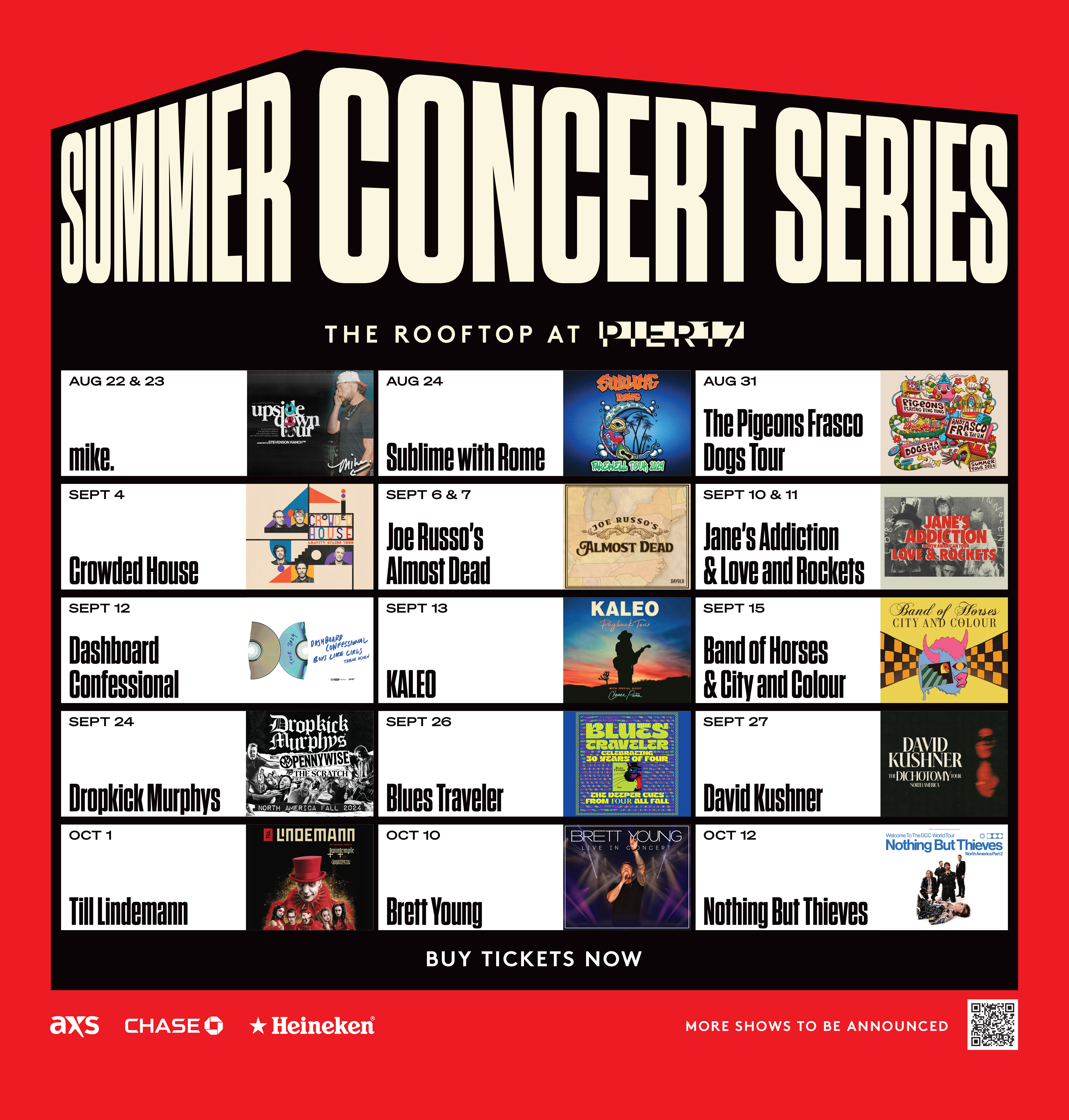
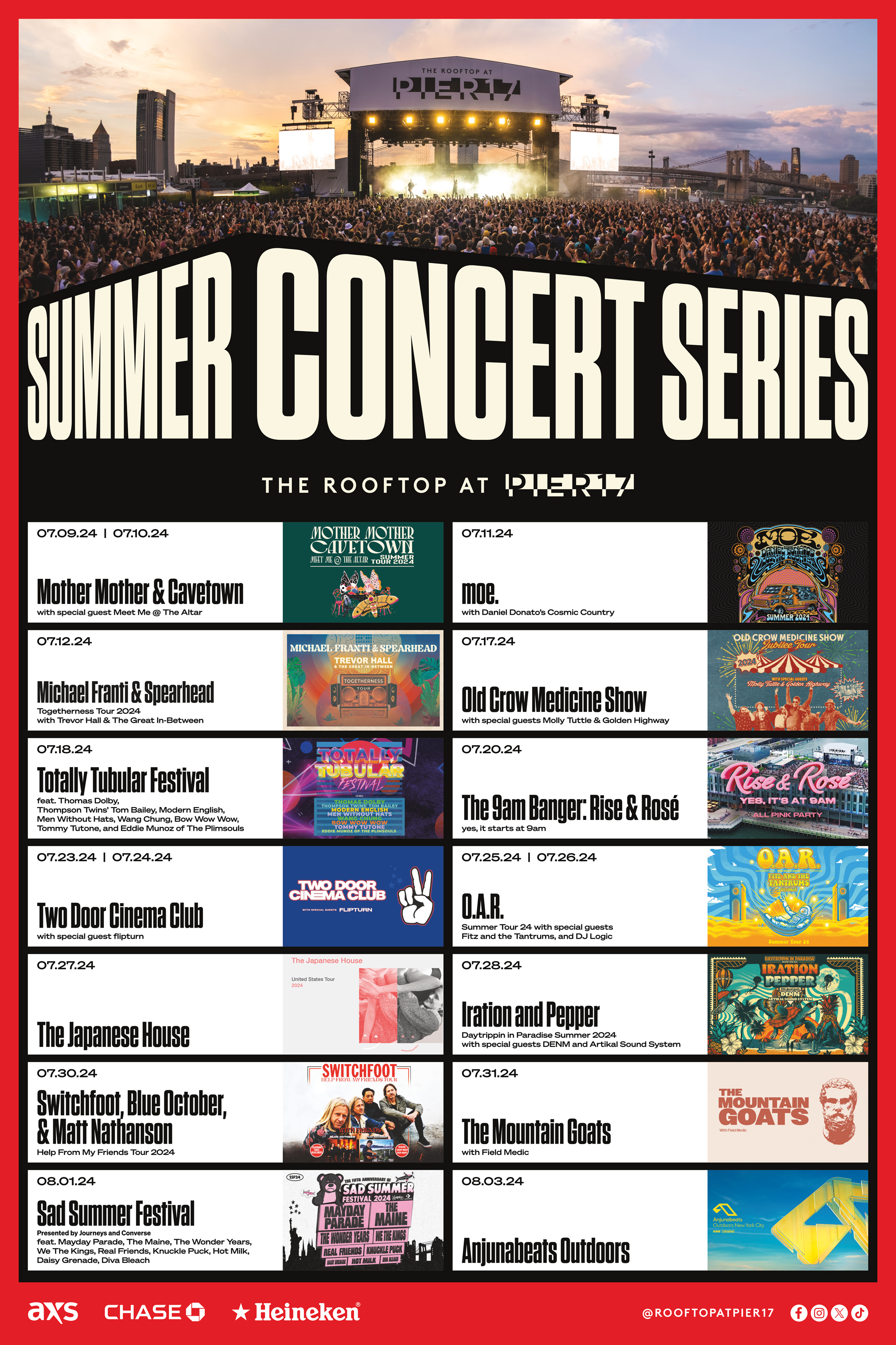
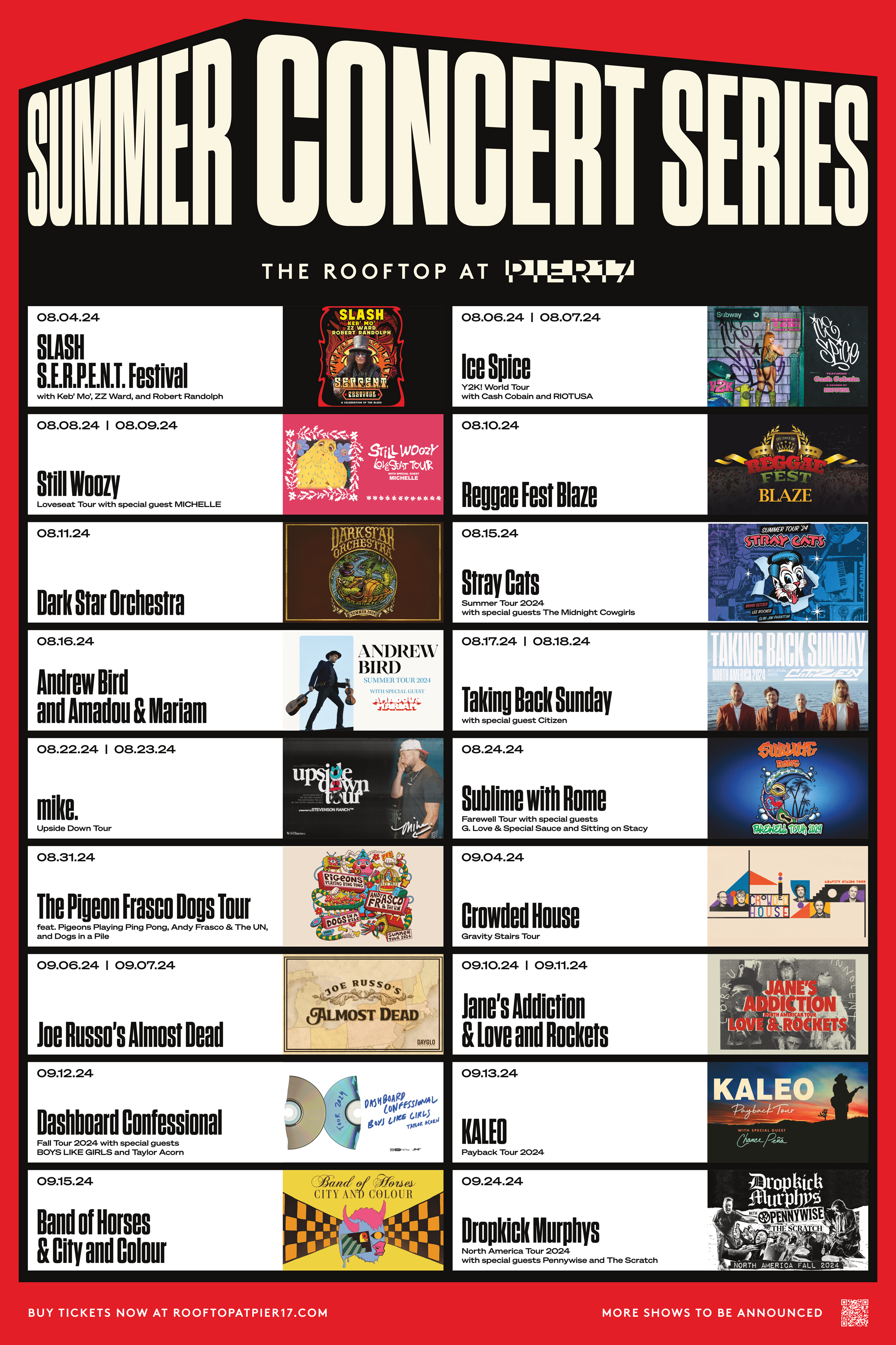
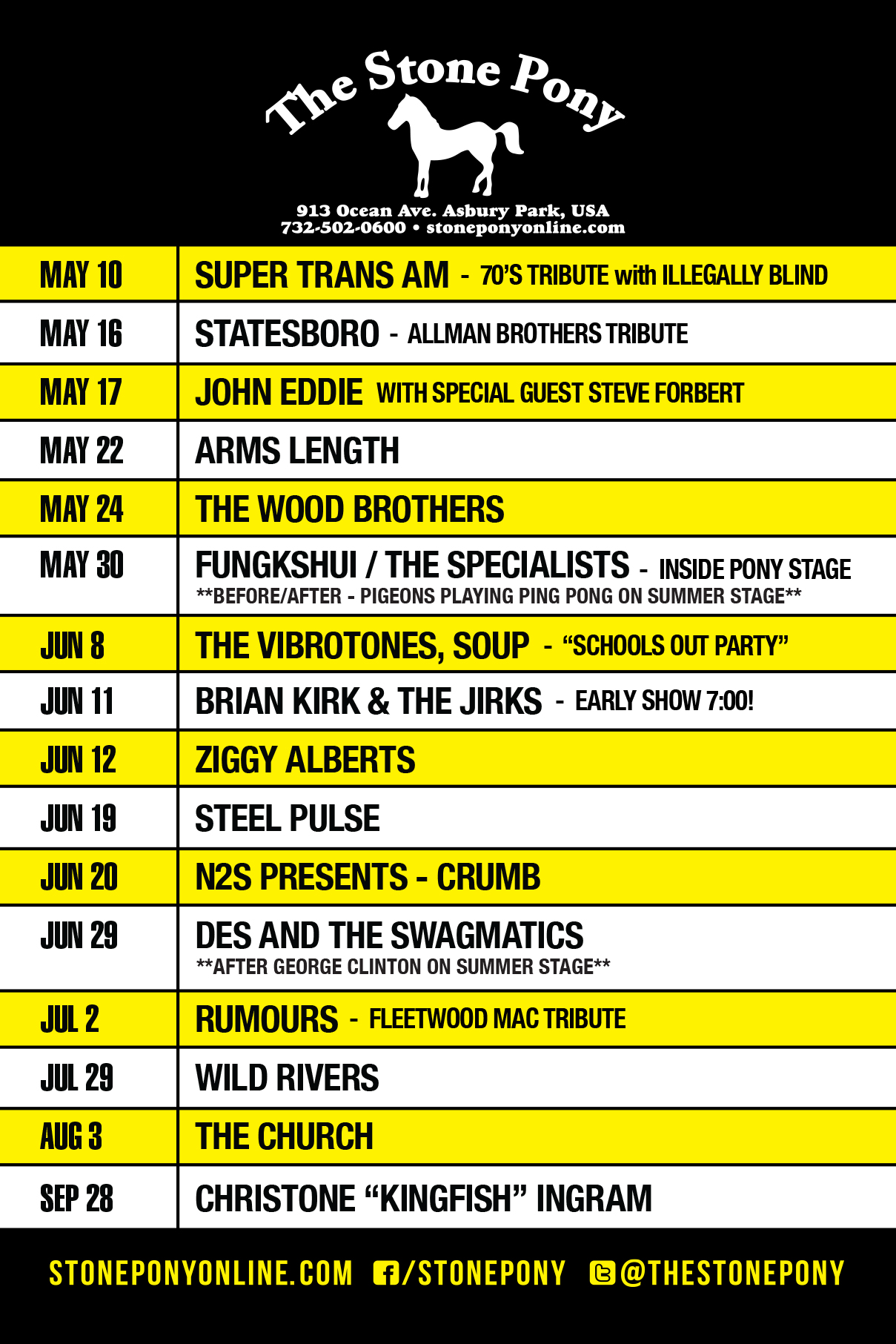
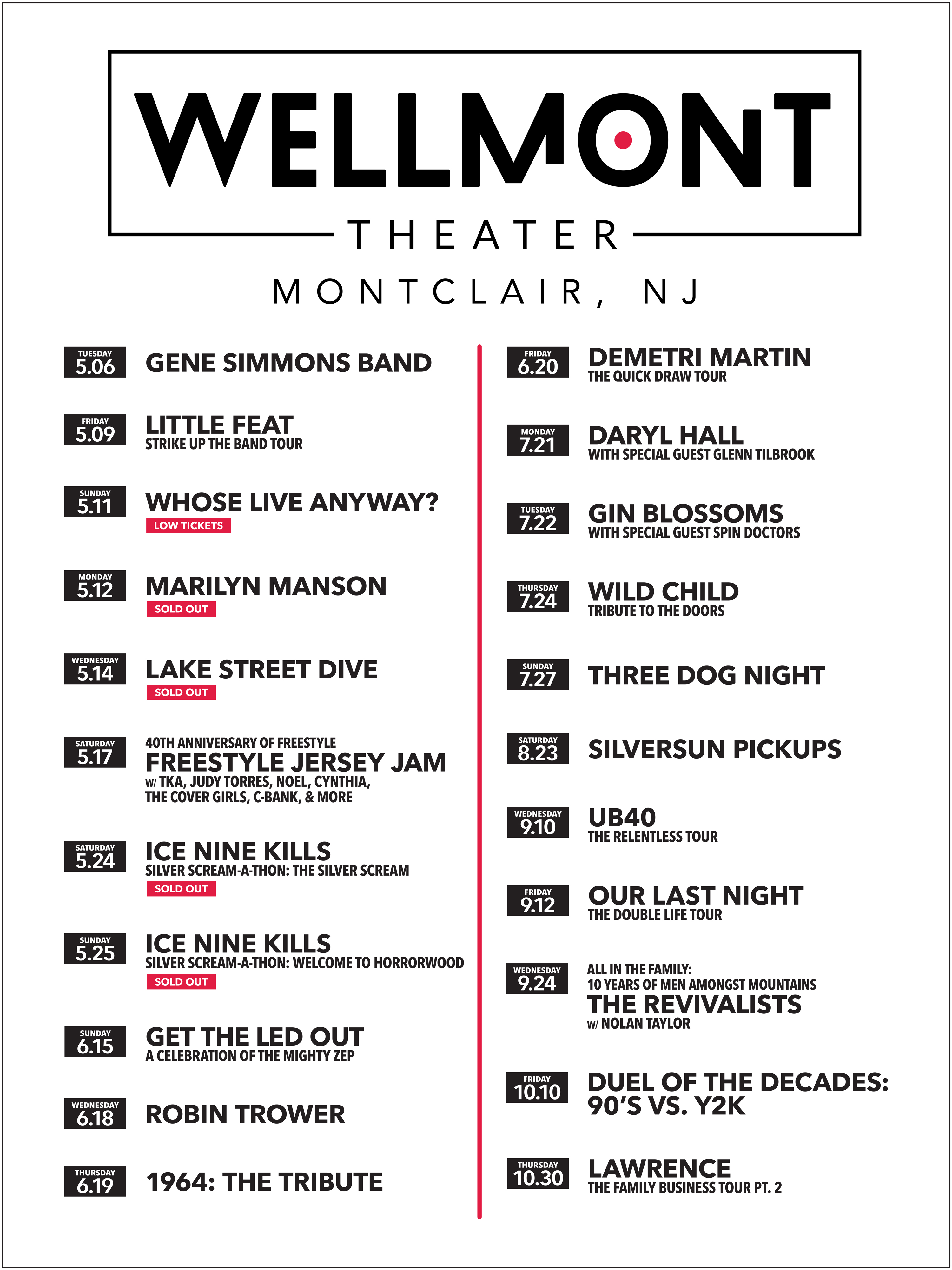
VENUE SCHEDULES AND POSTERS
As Production Designer at AWMedia, I lead the creation and execution of detailed show calendars and schedules for a diverse range of venues along the North Atlantic coast. Each calendar is strategically designed to align with the unique branding of the venue or to support seasonal marketing campaigns, such as summer concert series. In addition to digital formatting, I prepare these calendars for a variety of print applications, including large-scale posters, handout flyers, and corrugated display boards. This role uses my strong knowledge of Adobe Creative Suite and print production standards, as well as the ability to quickly update and adapt schedules as new events are added to support venue promotion and enhance the audience experience.

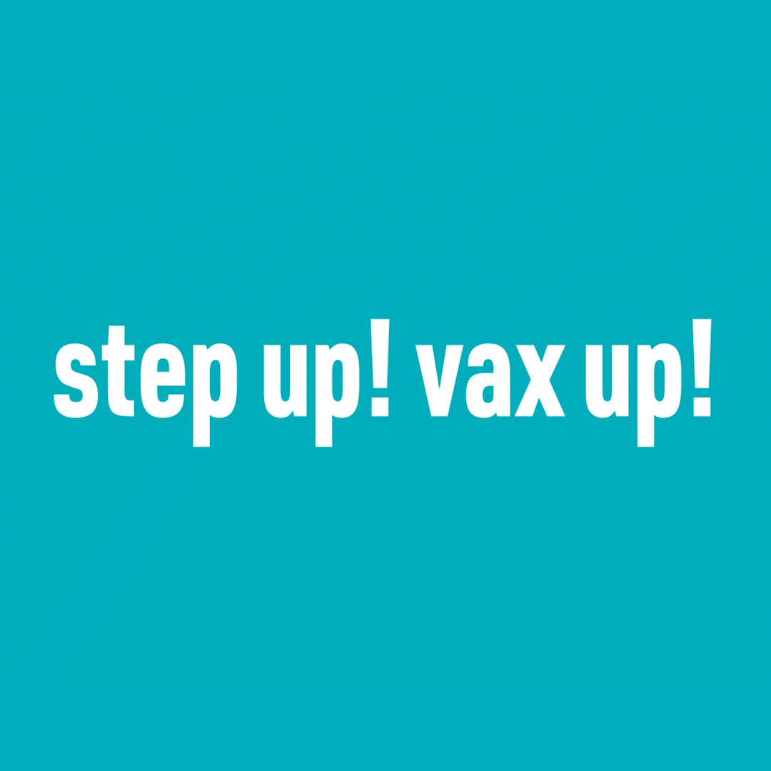
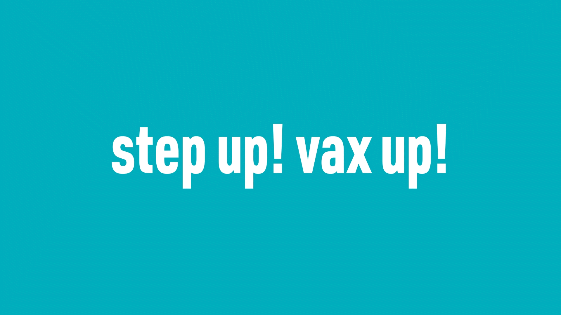
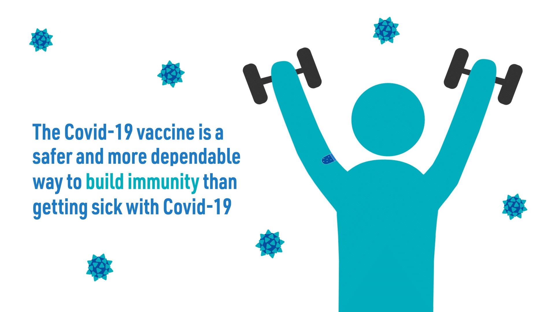
STEP UP VAX UP CONTEST WINNER
This grand prize winning entry in the Partnership for Maternal and Child Health of Northern New Jersey’s Step Up Vax Up Campaign emphasizes the importance of getting vaccinated against COVID-19 to college aged students. As a PSA that educates and spreads awareness to college campuses about the virus, my goal was to present the information in an engaging and informative manner so college students are motivated to share it on social media and around their campus. I particularly focused on the rhythm of the composition in Adobe After Effects, ensuring that there are consistently moving elements synced to the music so the viewer doesn’t lose interest or become bored at the influx of information. I also ensured that all graphics and typography followed the campaign’s existing brand guidelines to maintain a consistent tone across all platforms.


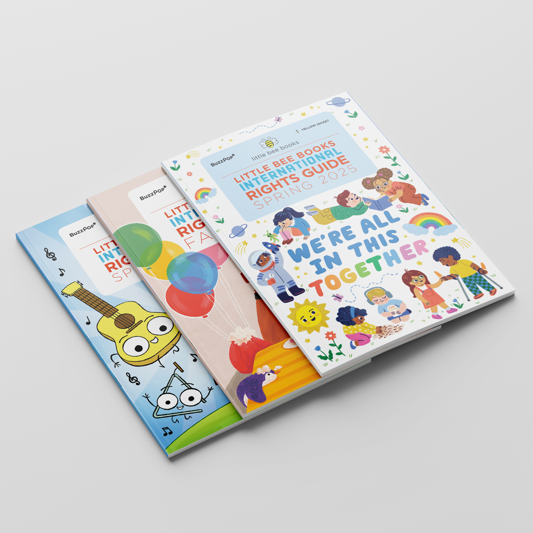
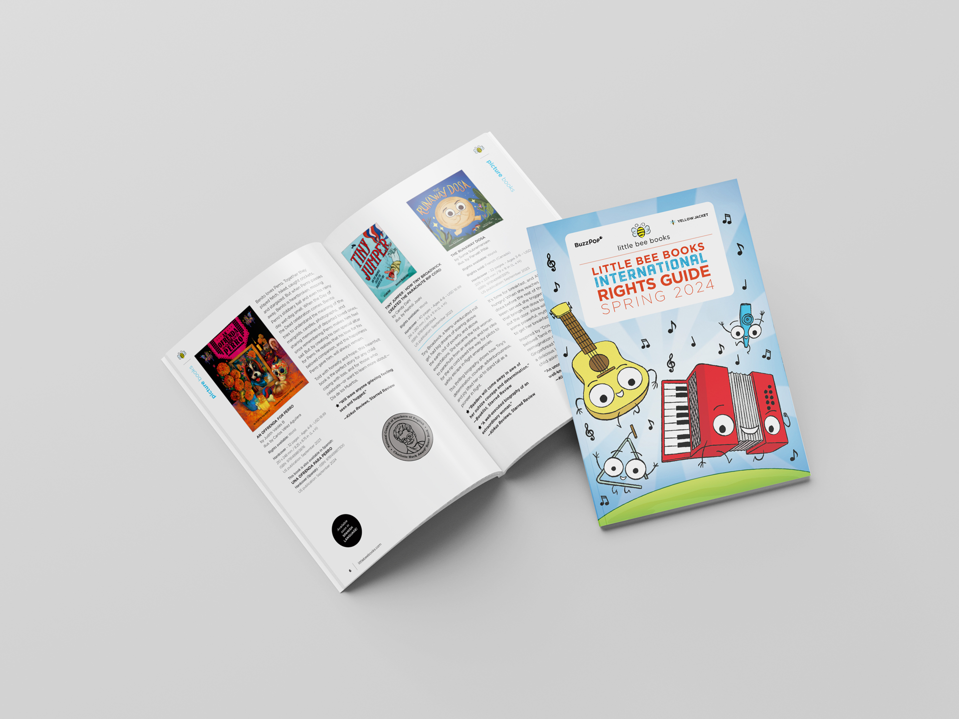
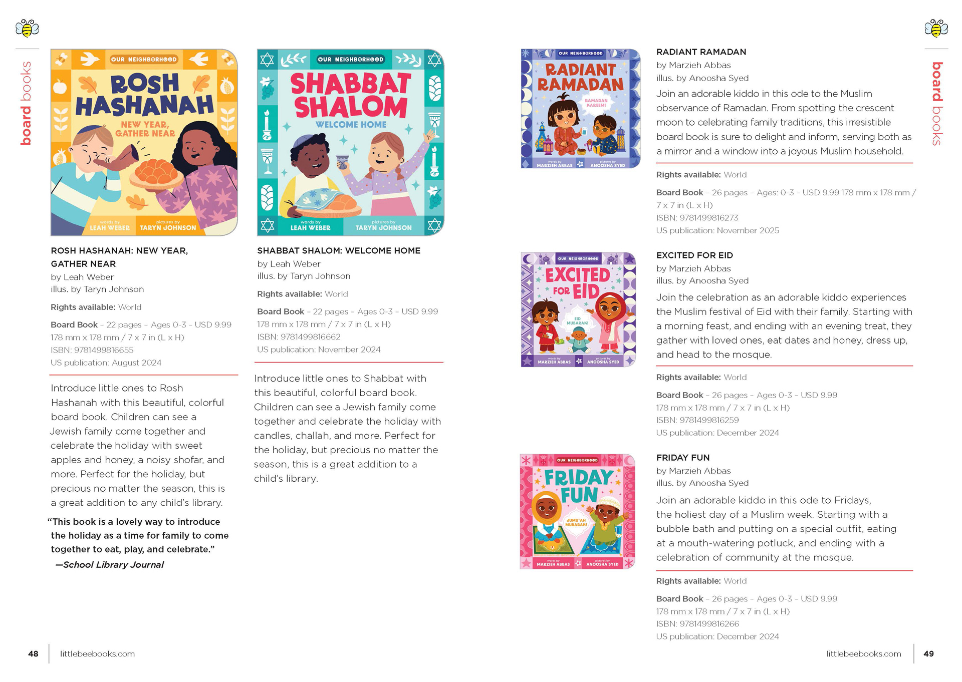
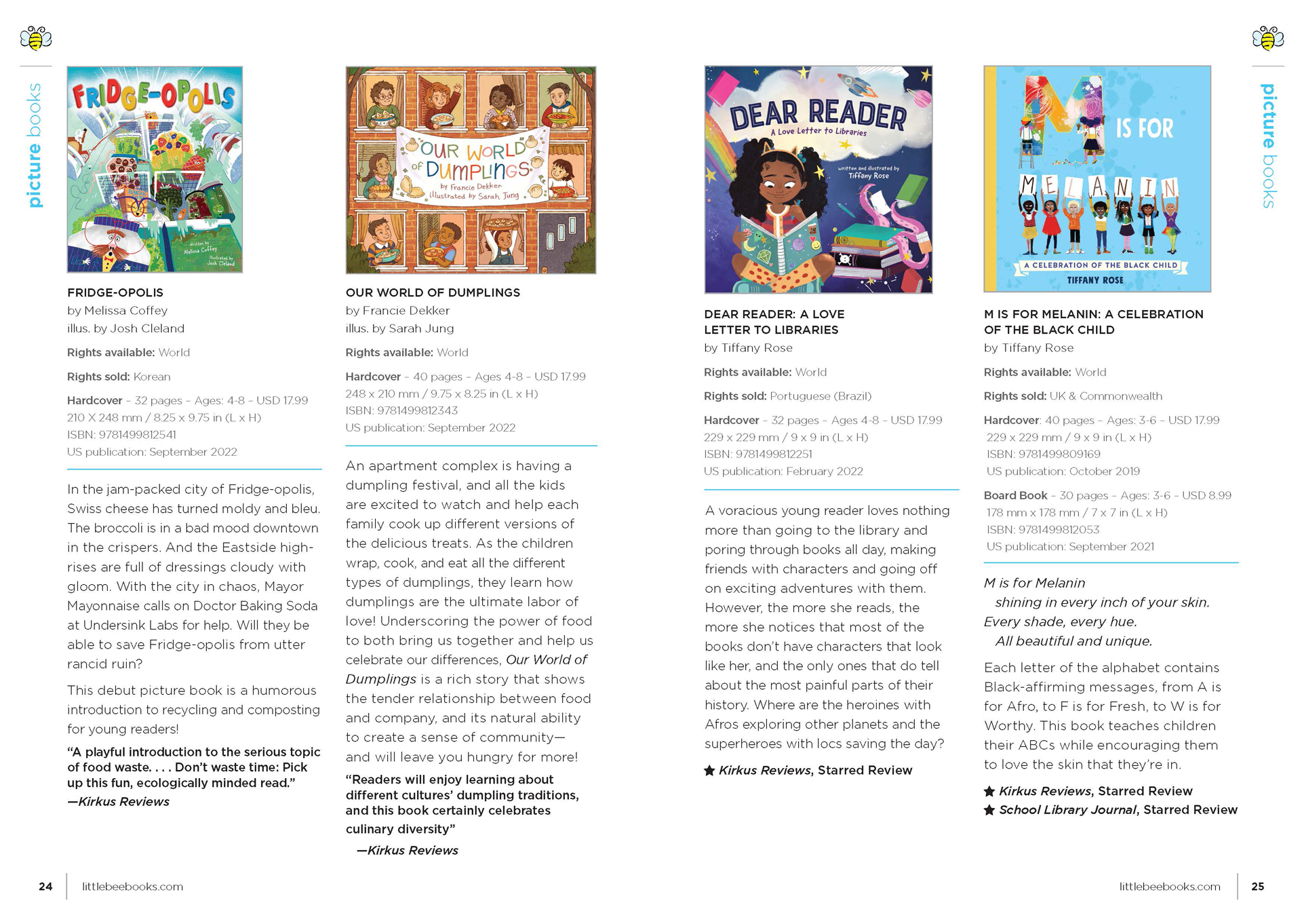
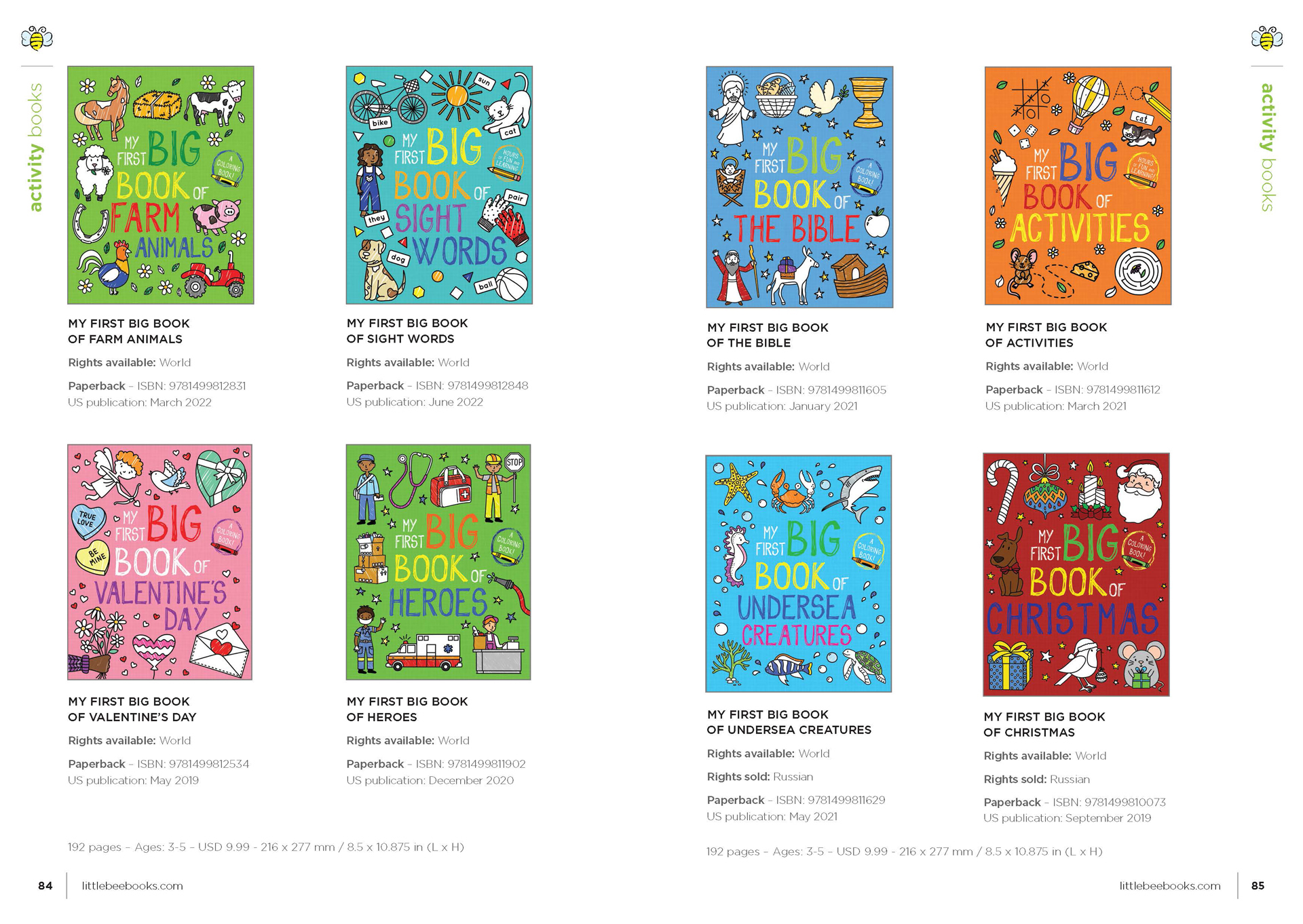
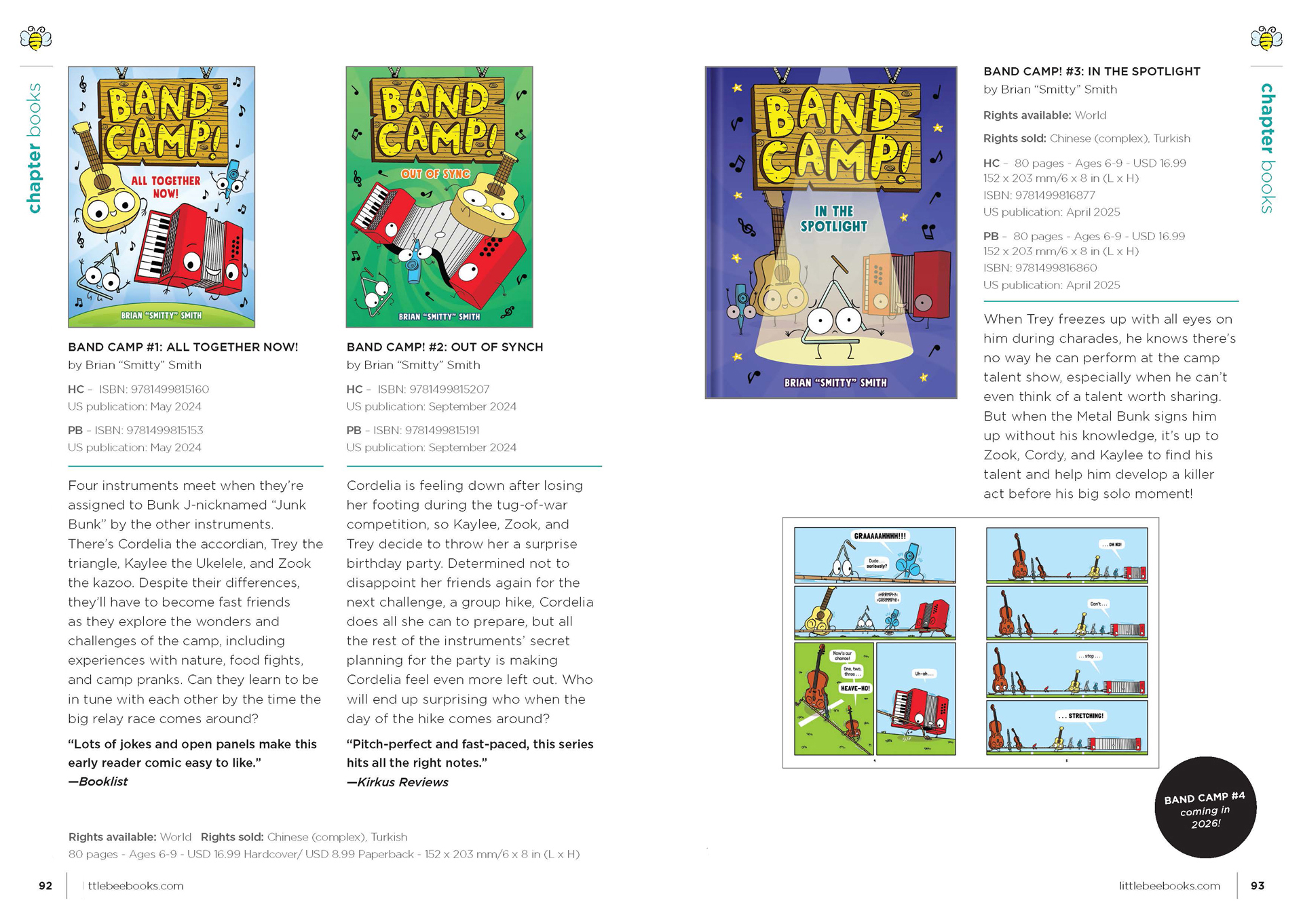
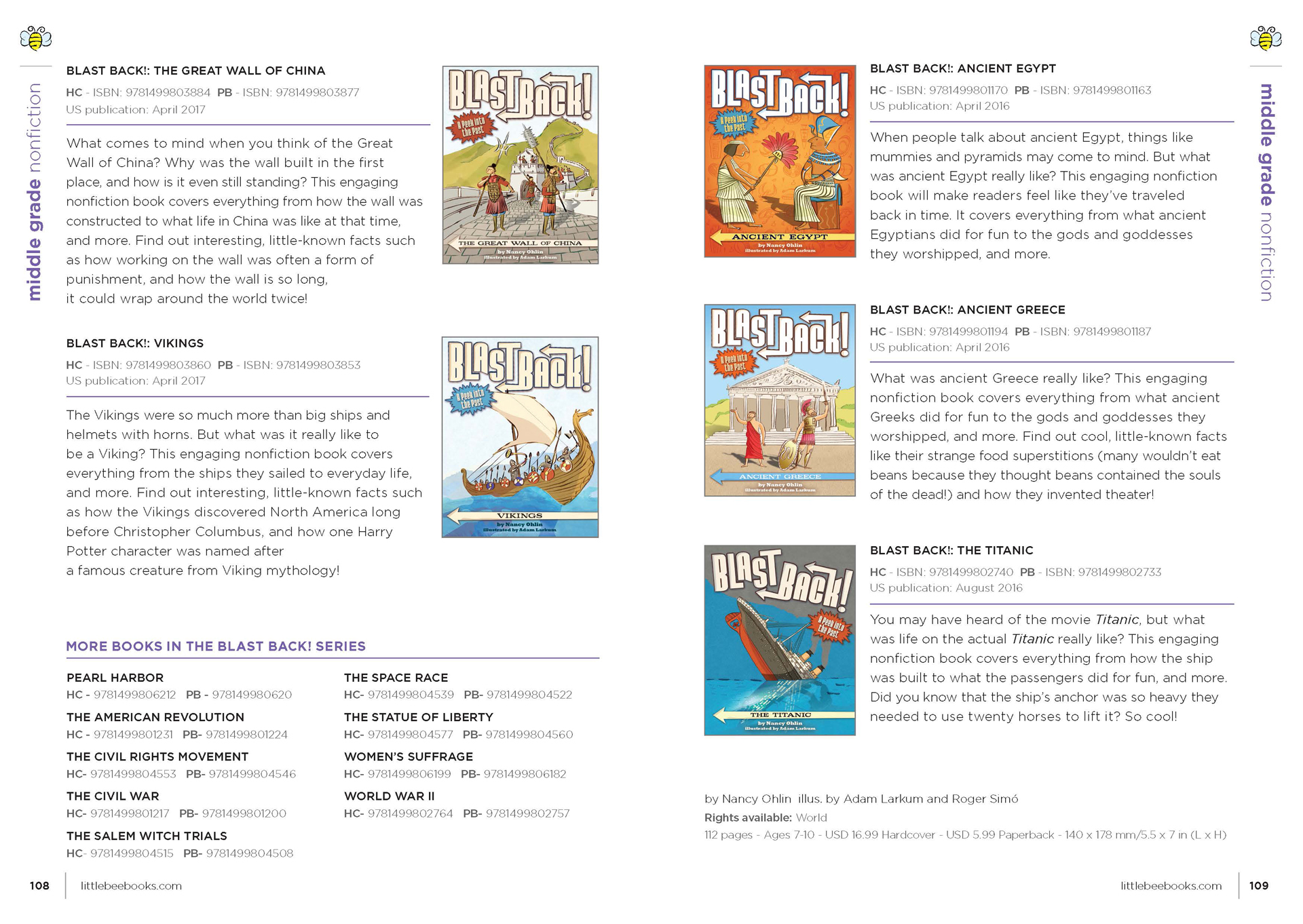
LTTLE BEE BOOKS FOREIGN RIGHTS GUIDES
As a freelance designer for Little Bee Books, I create a Foreign Rights Guide each season to showcase the company’s newest titles to international publishing partners. My work in this role reflects my strong proficiency in Adobe InDesign, as well as my deep understanding of layout design, typesetting, and visual hierarchy. I ensure each guide is both visually engaging and easy to navigate and export them for both print and digital use. Working as a freelancer alongside my full time position strengthens my ability to manage multiple projects independently, communicate clearly with clients, and consistently deliver high-quality work on schedule.


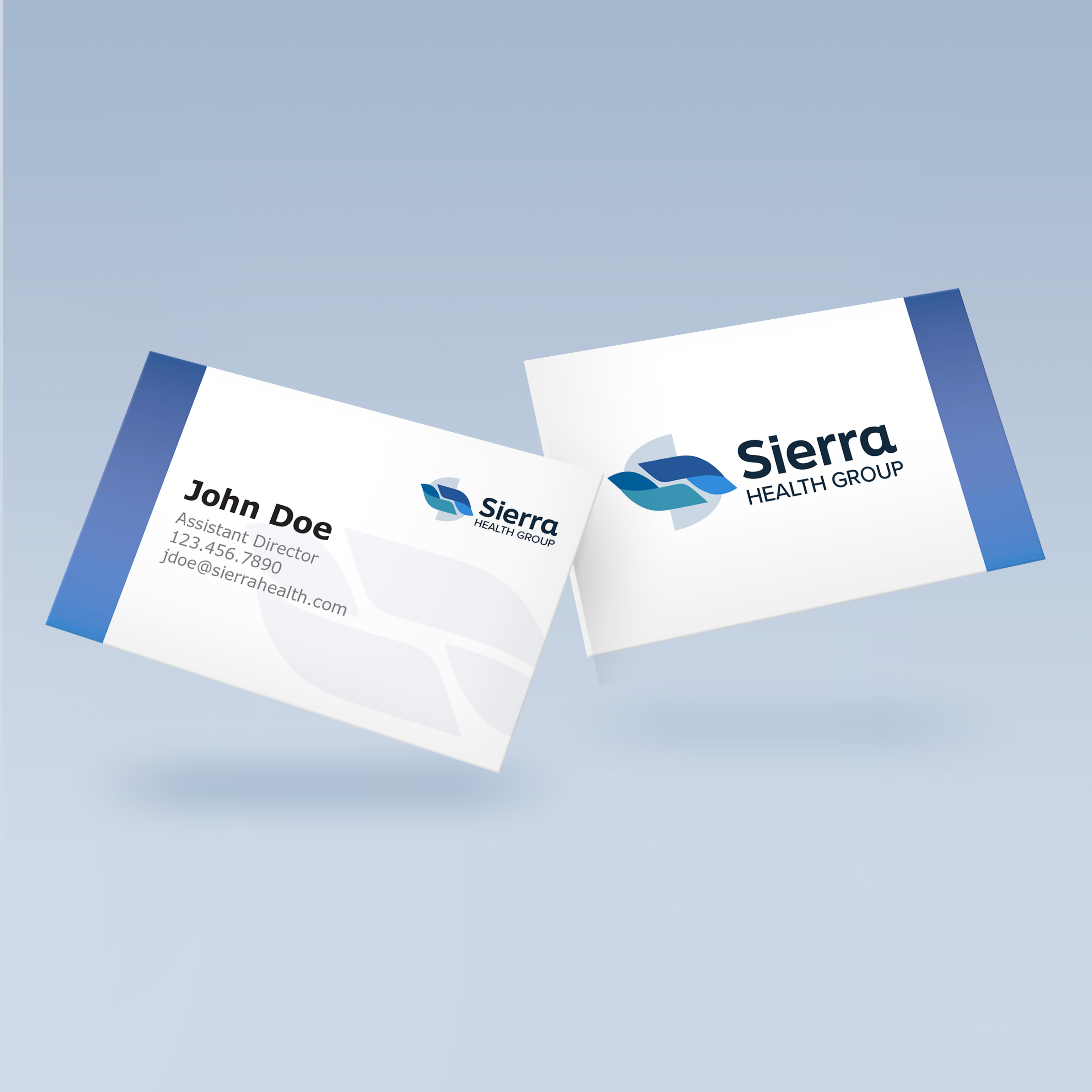
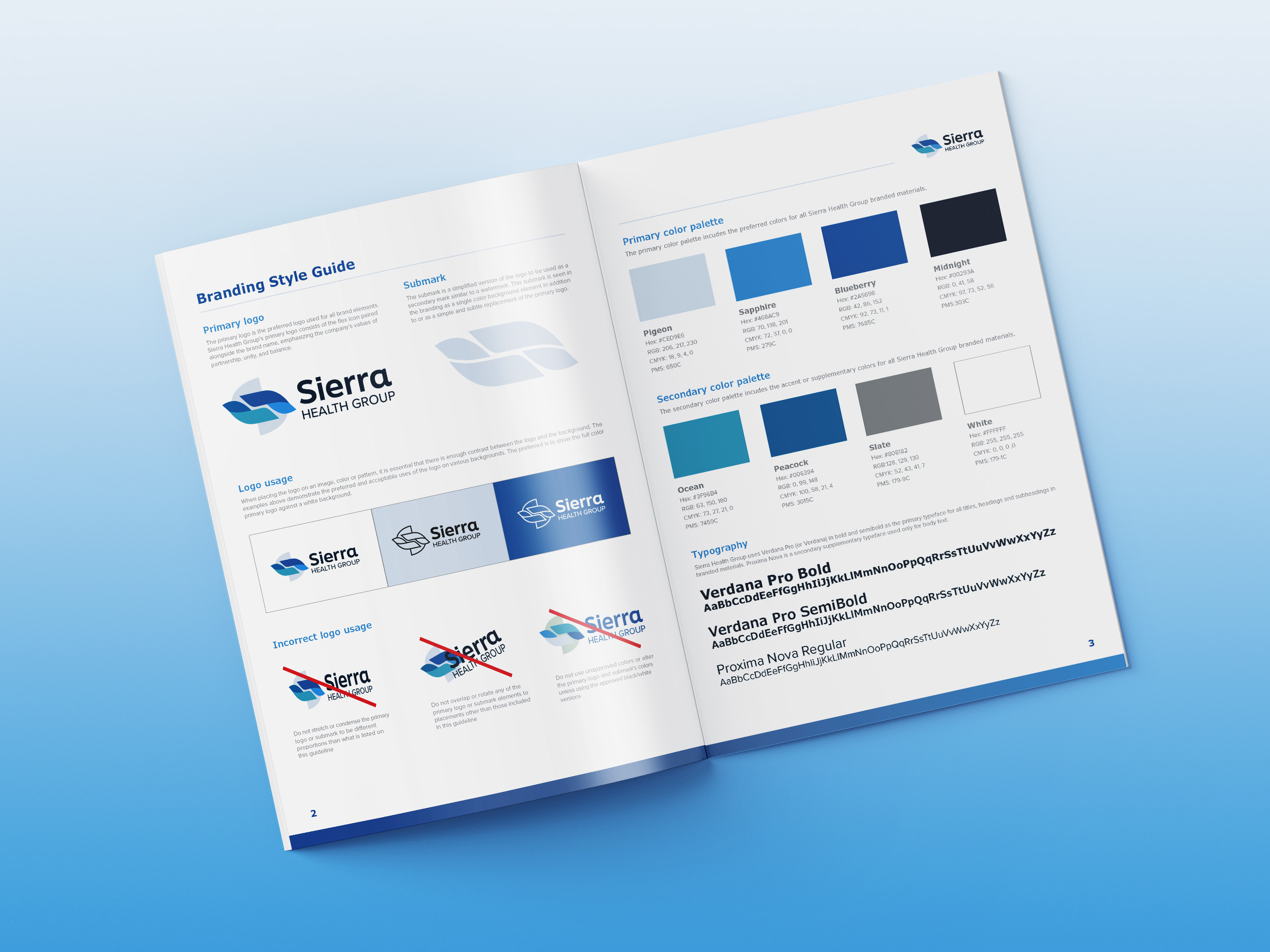
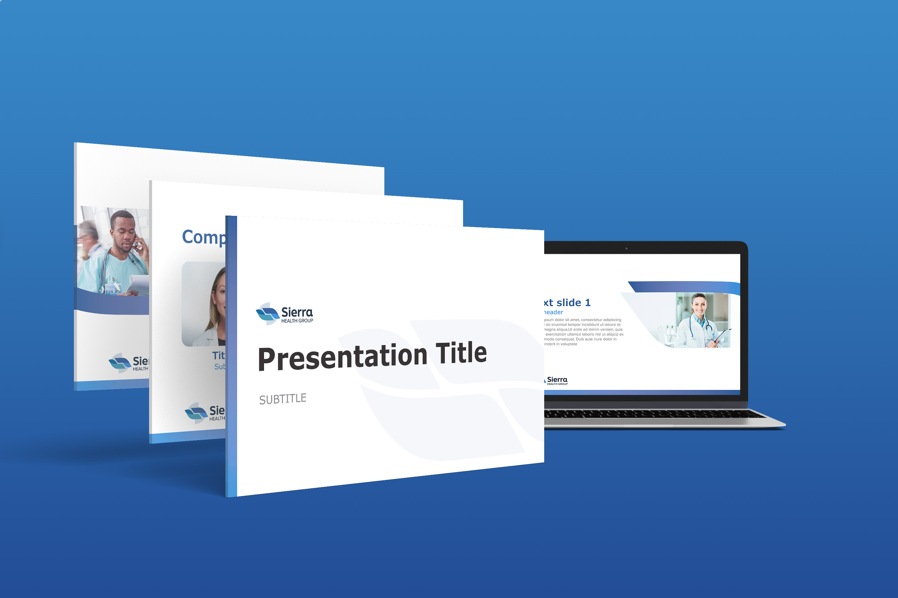
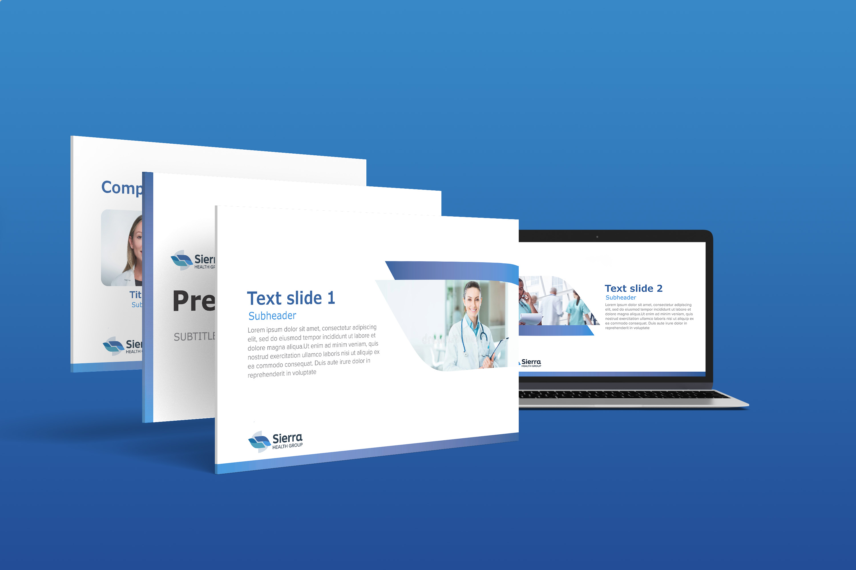
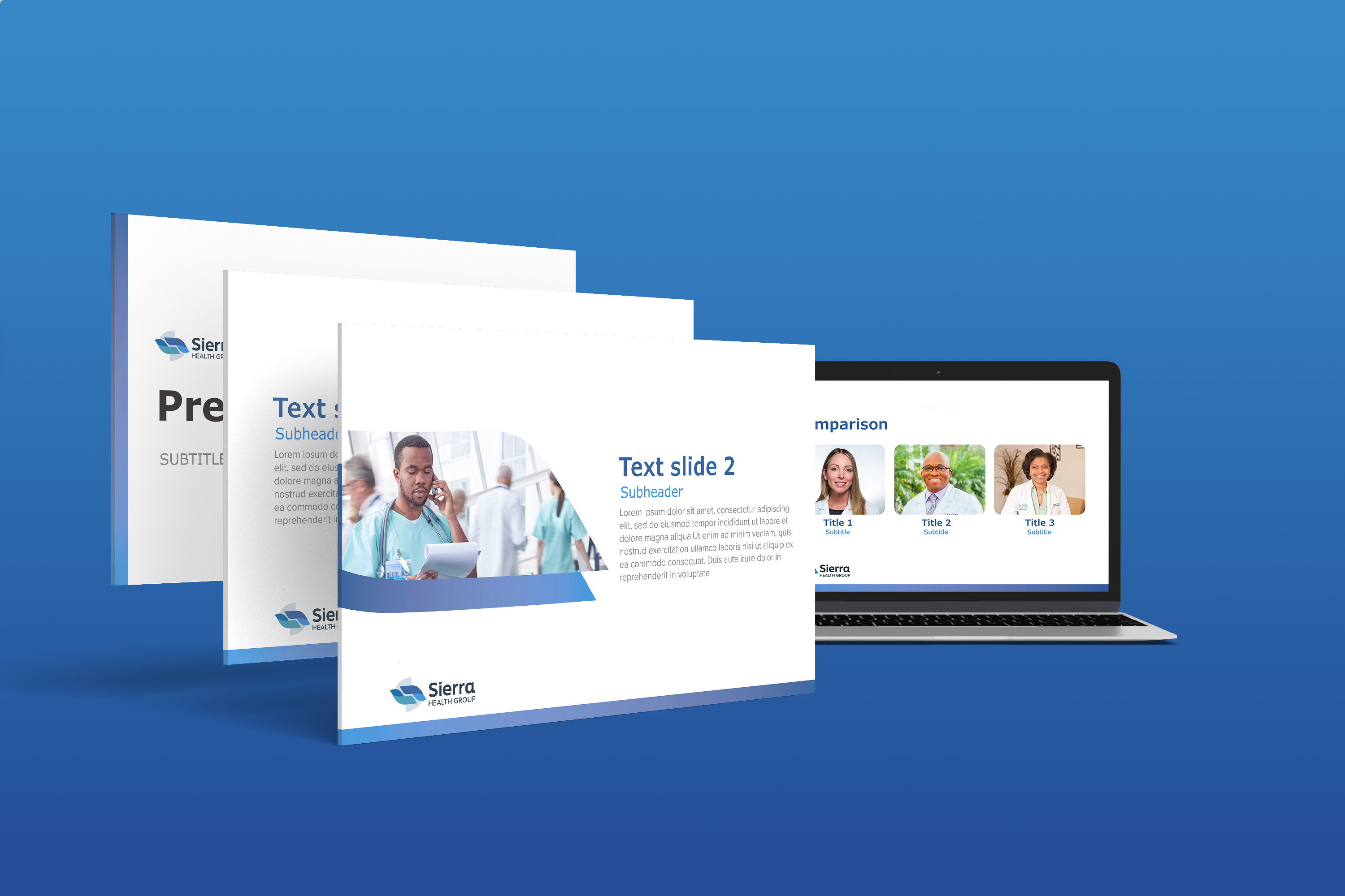
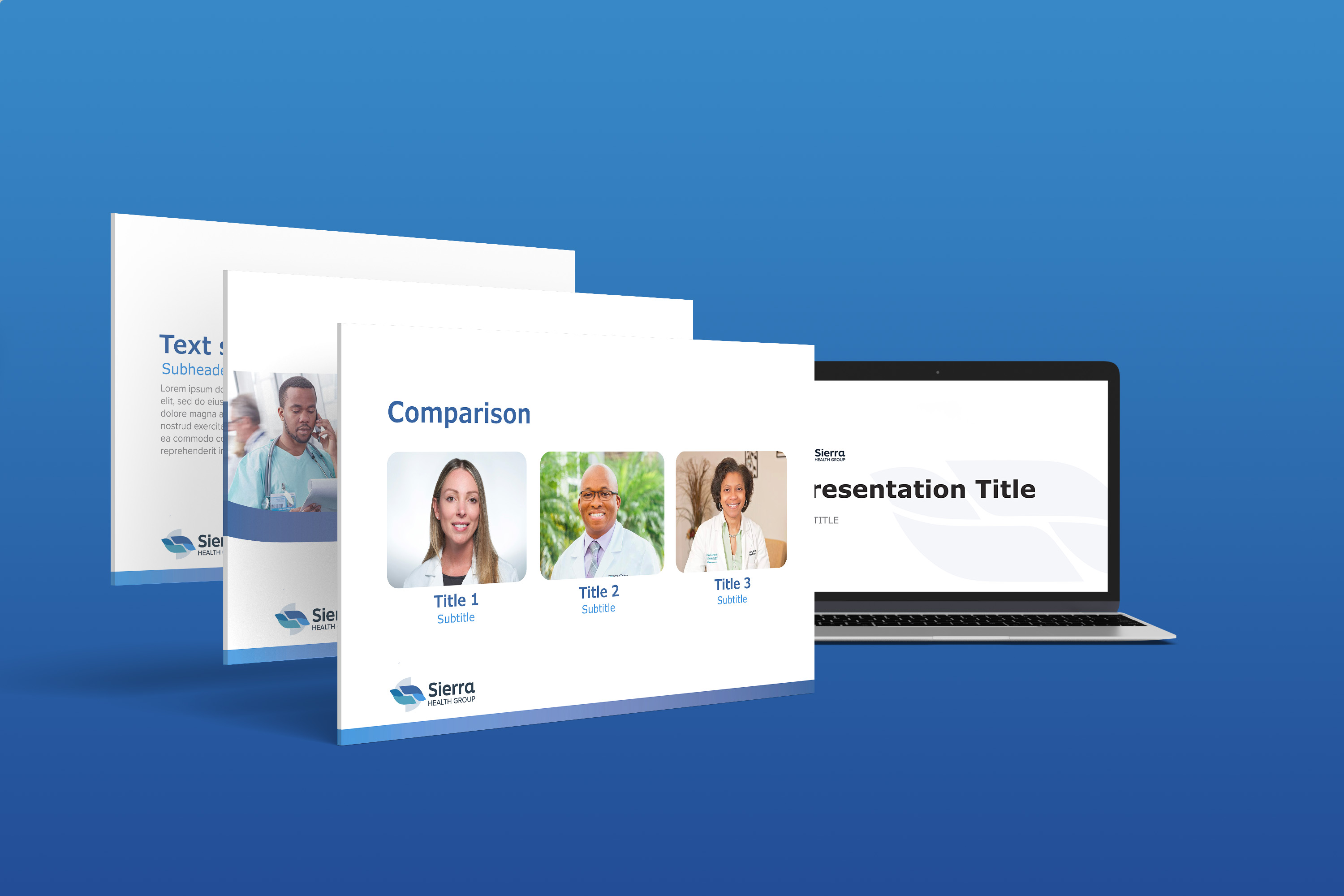
SIERRA HEALTH GROUP BRAND REDESIGN
New Jersey based hospital and physician revenue cycle service provider Sierra Health Group asked me for a brand redesign to reflect their commitment to flexibility and customized solutions. The centerpiece of the new brand identity is the icon, featuring a blue and teal color scheme and flexible shape conveying partnership, unity, and support for work/life balance. The design of the brand identity is both corporate and professional, with a minimalist and modern touch provided by the use of gradients. The balanced blue and teal shapes in the icon and graphics create a sense of harmony, while the use of gradients adds depth and dimension. This project showcases my ability to create a cohesive and effective brand identity that accurately represents a company's values and mission as well as my proficiency in using design principles to communicate complex ideas and emotions through visual imagery.


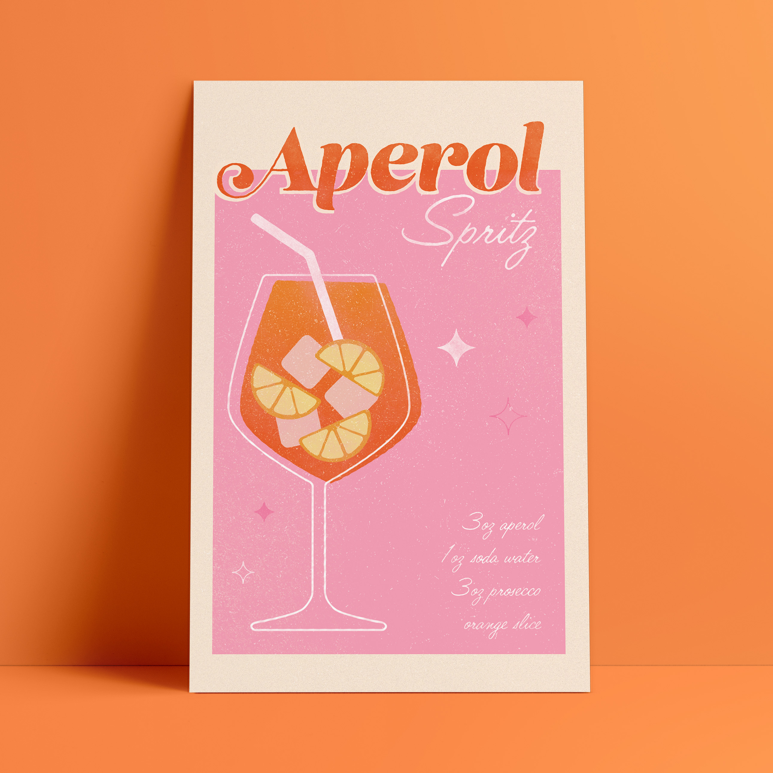
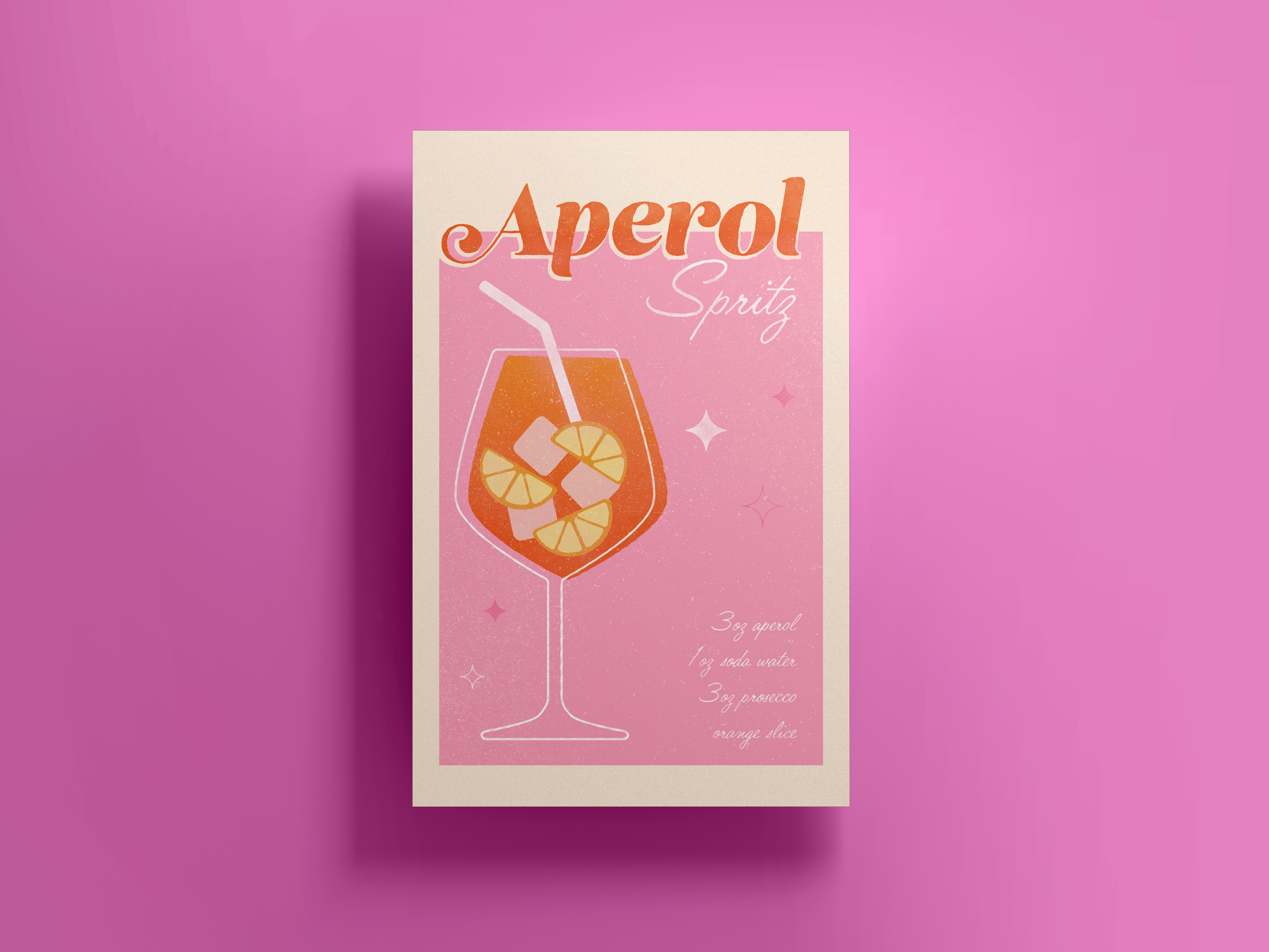
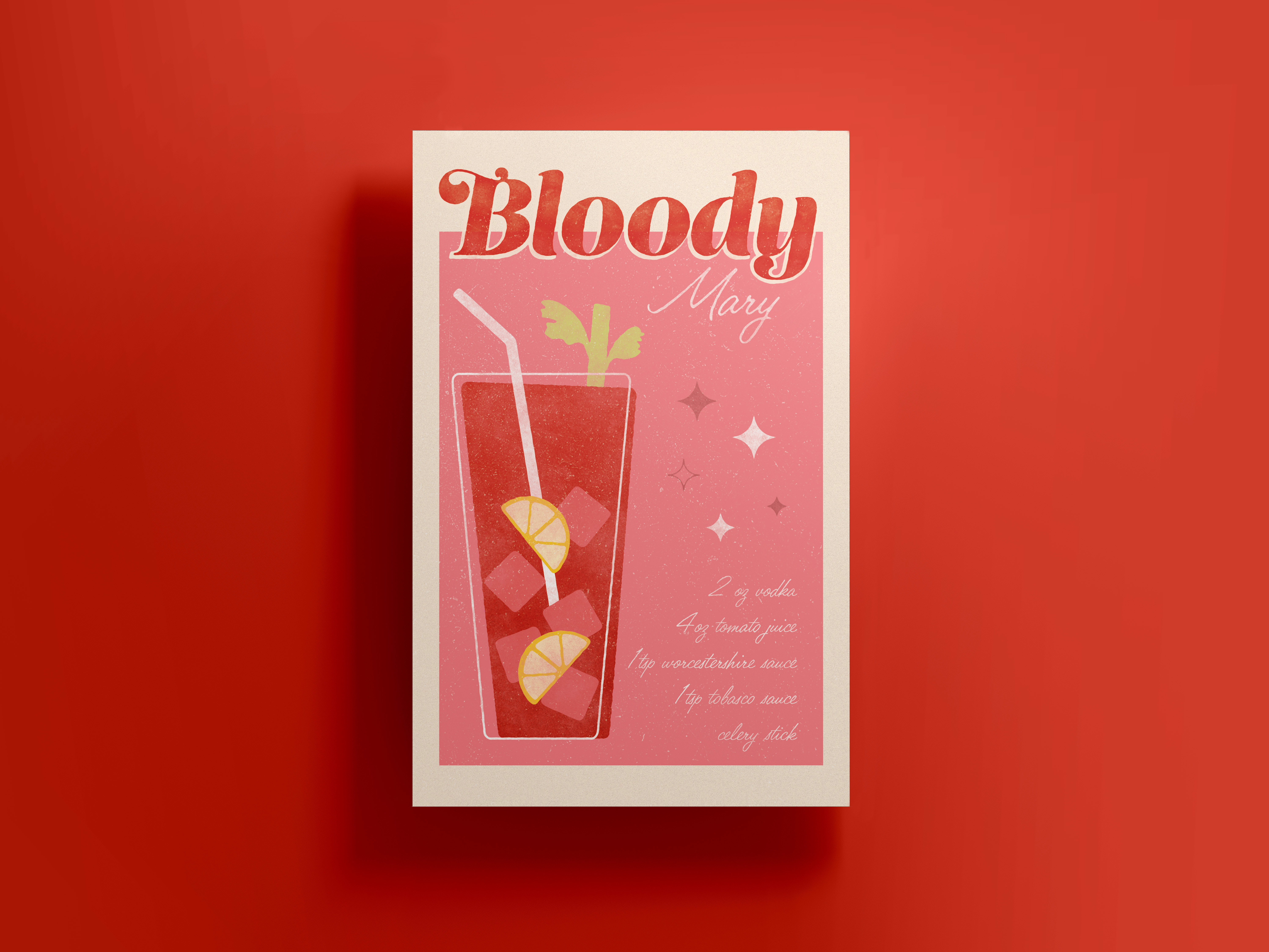
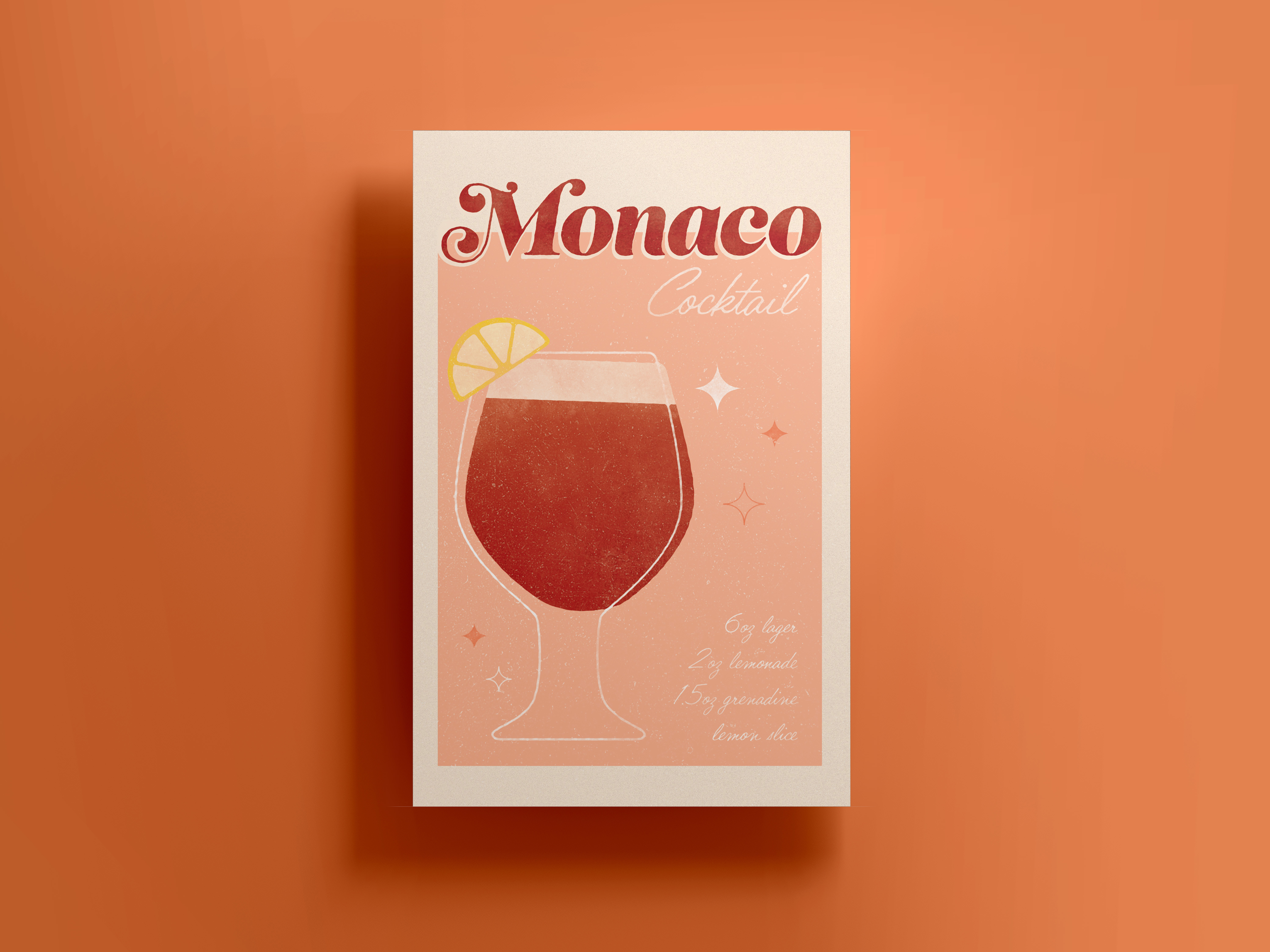
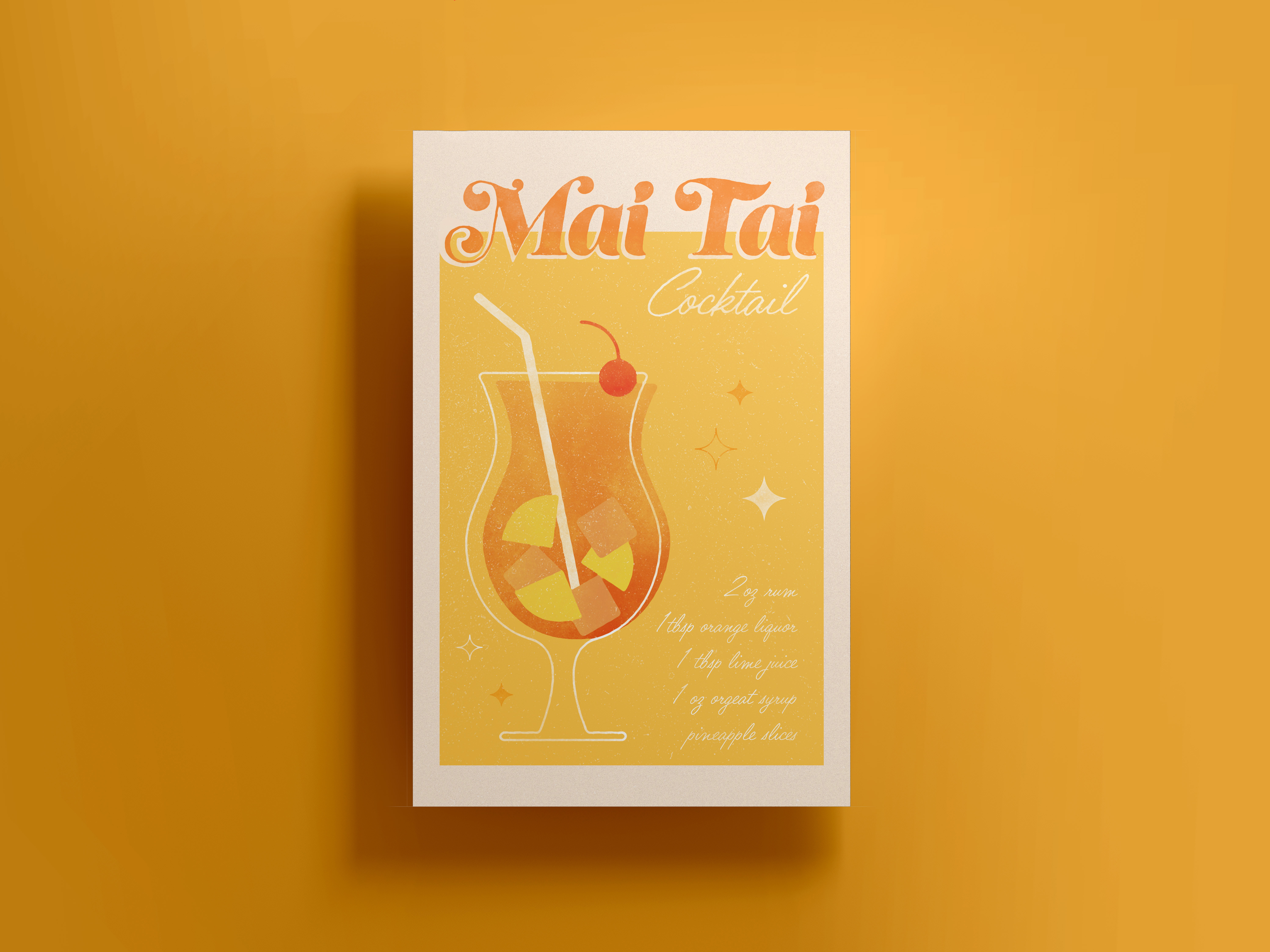
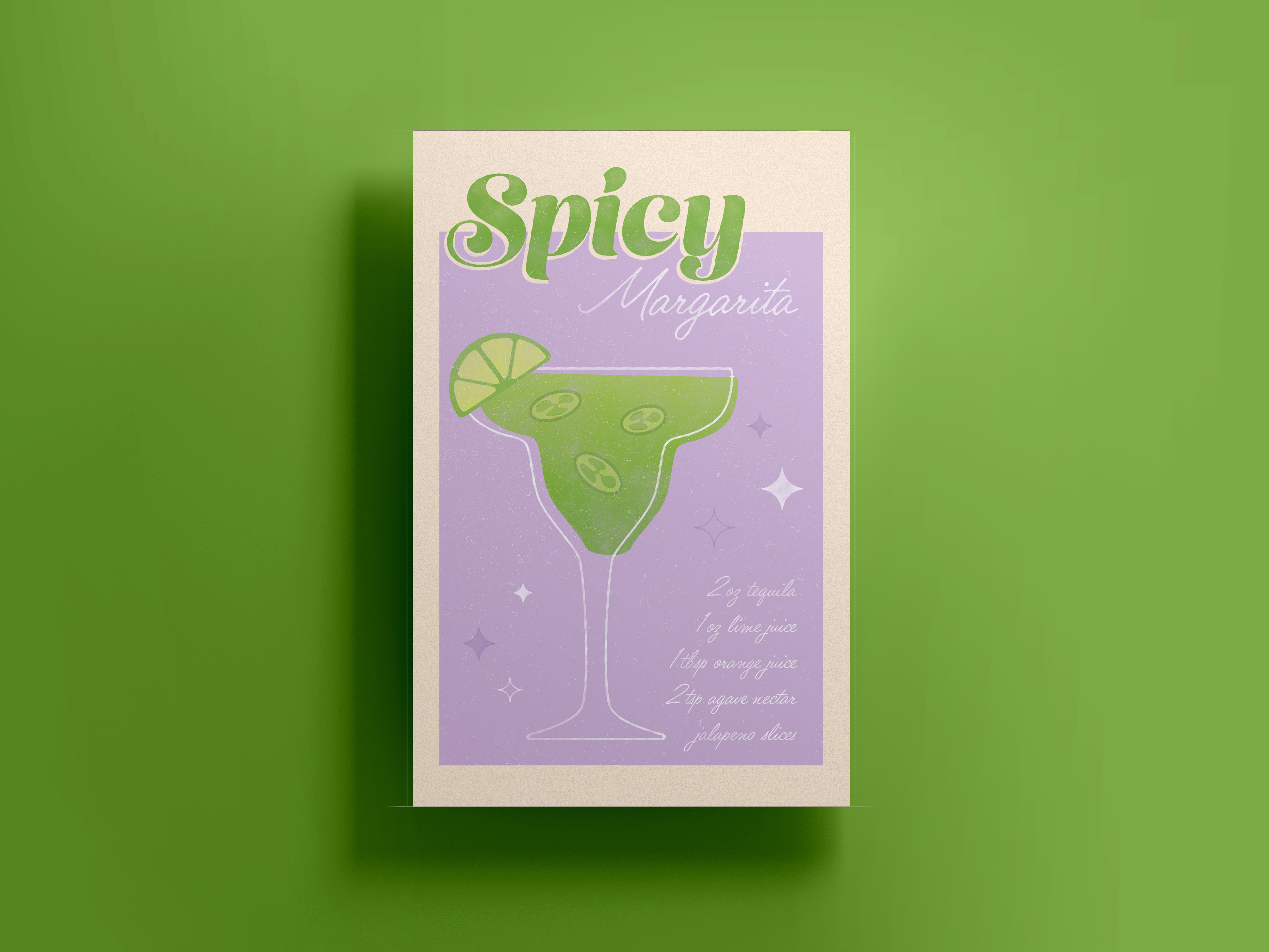
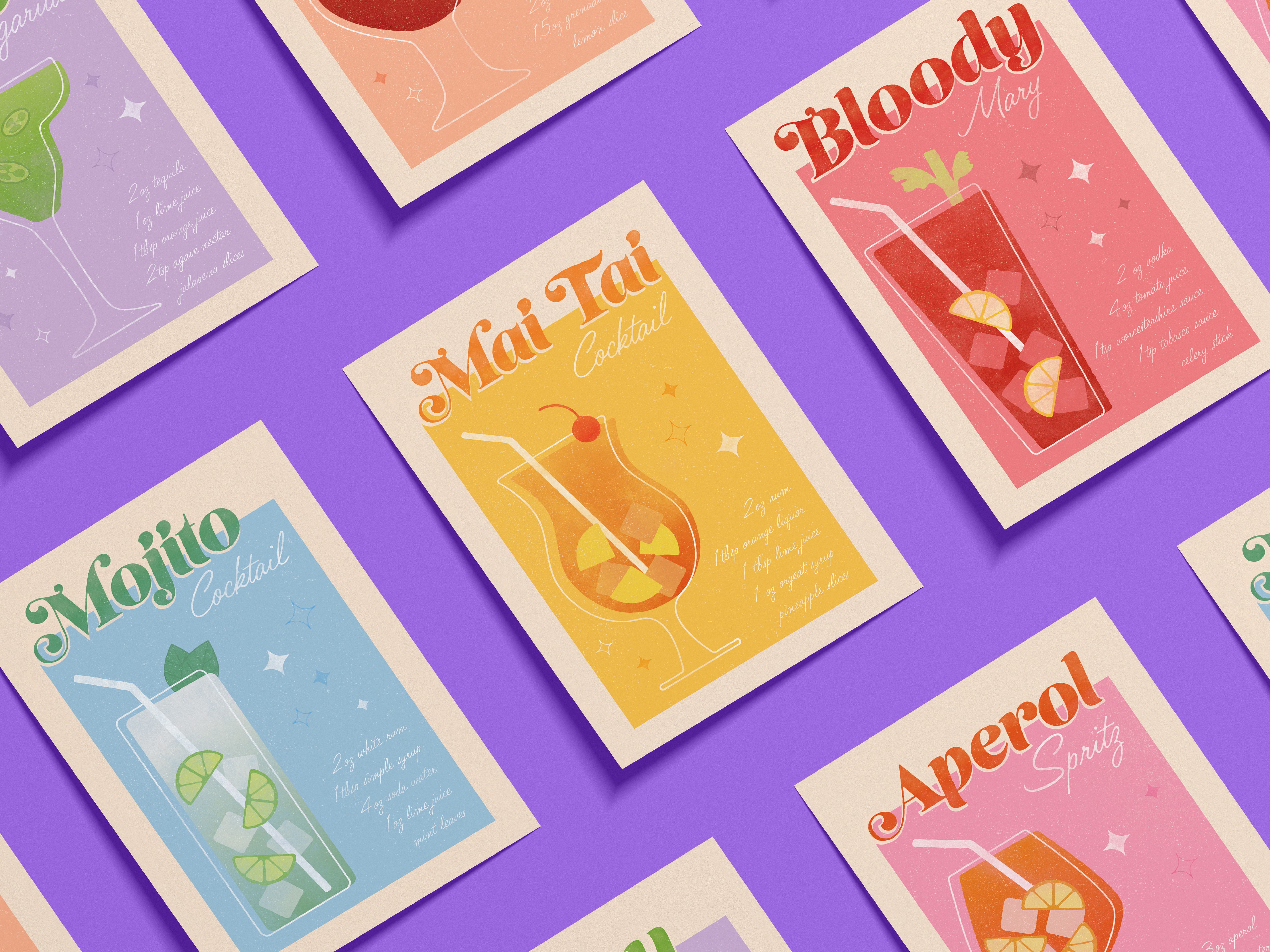
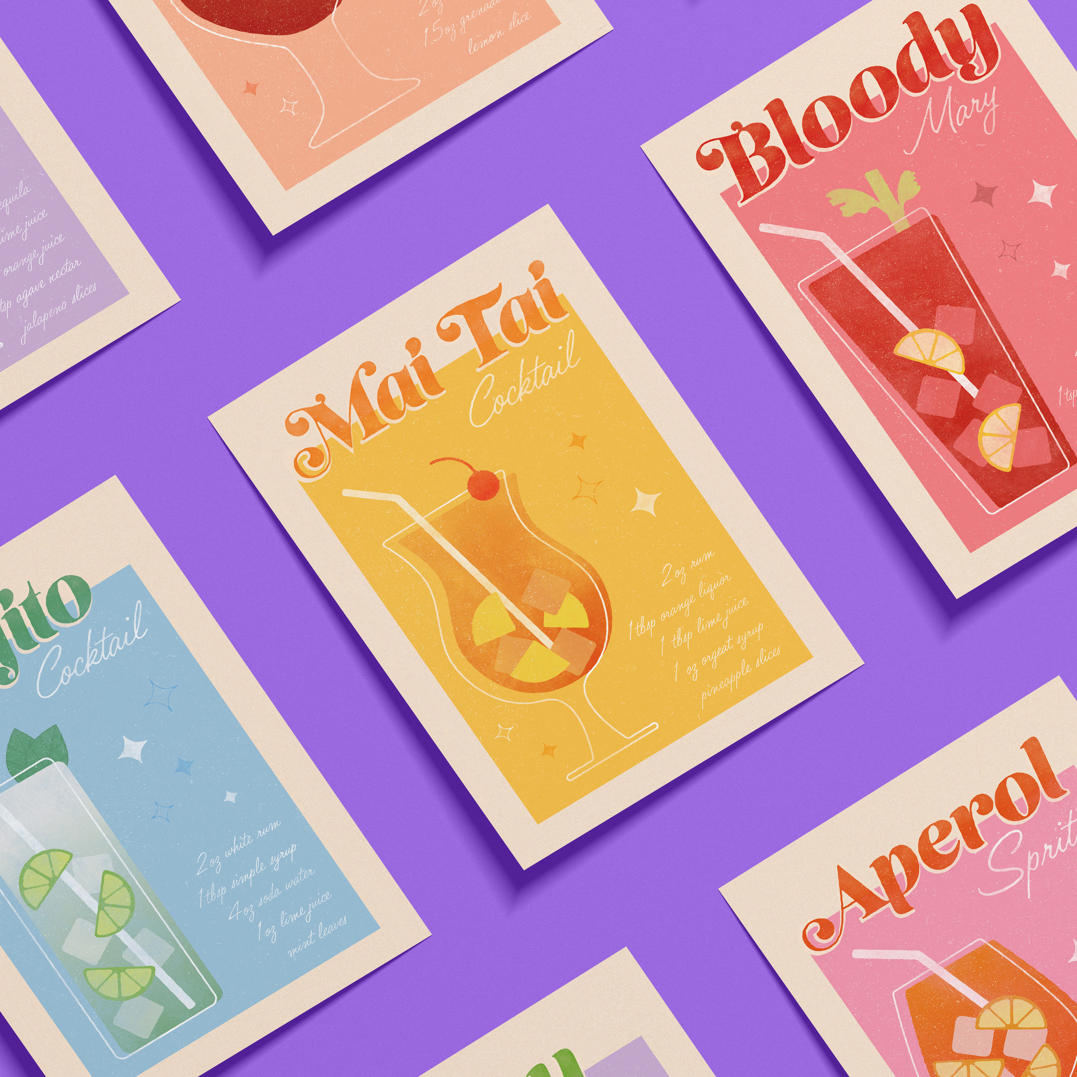
RETRO COCKTAIL POSTERS
This personal project showcases an array of posters featuring different cocktails, each with a unique color scheme and playful illustration. I took inspiration from the vibrant and eclectic style of the 70s, focusing on bright colors and textured elements to give each poster a retro feel while also making them feel modern and fresh. The use of Adobe Illustrator and Photoshop allowed for a clean and polished final product, with each detail carefully crafted to depict each cocktail in an eye-catching and captivating manner.